When it comes to big data, one of the most effective ways of using it to make decisions is with data visualization. Creating relevant charts and graphs from your data and managing them on an easy-to-interpret dashboard can take a company’s decision-making capabilities to the next level.
However, when it comes to the process of visualizing data, there are a few mistakes that make the results less effective.
Before we dig into the pitfalls of data visualization, let’s take a look at the basics.
What Is Data Visualization and Why Is it Important?
As the name suggests, data visualization is the process of depicting data in a visual format, such as a graph, an infographic, or a chart.
Why does data visualization matter in business?
Because visualization doesn’t just make data look pretty. It also makes data (whether it’s big or small) easier to understand. The human brain processes visual data far better than any other type of data—and it also responds better to it. We can process images 60,000 times faster than text.
More importantly, data visualization helps us identify patterns, spot trends, and detect outliers much faster.
There are countless options for visualizing data. Excel, Power BI, and Tableau are just a few in the market. The tool you use matters far less than the data behind the visualizations and the decisions you make from the information you see. An Excel spreadsheet may meet your needs. Or you might need an off-the-shelf visualization tool or even something custom built.
As I’ve said before, technology is a tool. How you use the tool, in this case data visualization, is important for success. And we see companies make the same mistake time after time.
The Big Pitfall: You Don’t Know What You Want to Know
The most common data visualization oversight we see is diving in without first laying out what information you want to know and what decisions you want to make.
It’s easy to skip this step—it’s more fun to look at charts and graphs than to spend time thinking about what value you want from the data. Trends in the last few years show companies are drowning in data, but starving for insights.
We have unparalleled amounts of data and struggle to turn it into decision-making information. All this data, especially when it’s misused or misinterpreted, can dilute what really matters. This is why the first step of data visualization has to be setting clear goals and expectations around what you’re trying to accomplish.
When you skip the step of identifying what you want to know and why, data visualization happens solely for data visualization’s sake. Without purposeful, strategic discussions about what you want to know from the data, you’ll be throwing spaghetti at the wall in hopes that something sticks.
Know Your Numbers
You’re on a deserted island, 5,000 miles away from your business. You have access to three metrics from your business. Could you pin down which metrics you’d want those to be? And, further, would you know what business decisions to make based on those numbers?
For each metric, you should have a plan for how you’ll interpret and use the resulting information. What actions will you take when the data shows a specific result? And you need context to make the most of your data. A number alone doesn’t mean much. In fact, you can make counterproductive decisions if you can’t interpret your data properly.
A few ways to add context include:
- Use benchmarks and past metrics as comparisons
- Set goals and expectations for what you might see in the data
- Establish consistent KPIs so you can continually evaluate the insights
Other Pitfalls: The Realities of Big Data
In addition to forgetting (or purposefully skipping) the important step of defining your goals for data visualization, there are other common mistakes we see.
Never Revisiting the Dashboard
It’s amazing how often companies will collect data, take the time to set up a dashboard, and then completely forget about it. It’s really easy to collect data—the challenge is organizing and doing something with it. It’s a mix of art and science to collect, manage, analyze, and use data to make business decisions.
Avoid this pitfall and revisit your dashboard at planned intervals (daily, weekly, monthly). Remember that, as easy as it is to collect data, it’s even easier for it to become irrelevant, obsolete, or both.
Making Data Say What You Want It to Say
The fun (yet dangerous) part about data is you can essentially make it say whatever you want it to say. To make the best decisions for your business, however, it’s important to see an unbiased view and avoid manipulating the data to an extent that compromises the outcomes.
There are some great, albeit ridiculous, examples of making data say what you want it to say and finding trends that don’t exist.
Take this chart, which shows the per capita consumption of chicken and how it appears to correlate with US crude oil imports. Are these two items actually related? Probably not. But it sure looks like they are.
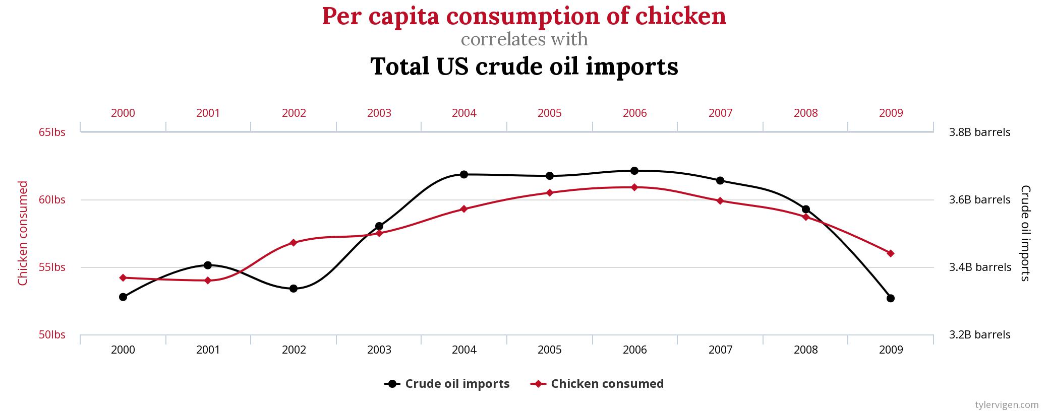
This chart depicts one of the most common data errors: false causality. When two or more lines that appear together in a chart look like each other, our brain tends to assume that they are related, even if their similarity is completely coincidental.
You can see more examples like this at Spurious Correlations by Tyler Vigen.
Other similar data missteps include:
- Cherry-picking: Hiding relevant information, such as outliers, in data sets to soften or minimize its impact.
- Omitting data: Omitting data from a visualization that implies a complete representation (like a pie chart).
- Sampling bias: Drawing conclusions from data sets that aren’t representative of the whole picture.
- Hiding behind fancy visuals: Distracting the viewer from the actual information with fancy graphs and charts.
The lesson here? Make sure you’re checking your biases at every step of your data visualization process to ensure you’re displaying and ultimately interpreting the information in a way that lets you make the best decisions for your business.
Do you have business data you’re not sure how to use? We can help!
Reach out.