A lot of the data visualization systems we build use transactional data sources provided by our clients—information generated in their business. But in some situations, there are external data sources we can use to take advantage of information
that has already been collected and made available for use.
In the Cedar Valley and Bi-State data portals, we did exactly
that. We integrated external data sources into the platform to increase the amount and value of the regional economic development information displayed to users.
In previous iterations of the data portals, staff members at the Greater Cedar Valley
Alliance & Chamber (GCVAC) and the Bi-State Regional Commission were manually collecting, manipulating, and uploading static data sets. In their new system, data is automatically pulled in, manipulated, and displayed, which saves the two organizations
tons of time and leads to a better experience for end users.
Learn more about the benefits of software integrations.
External Data Integrations
There is a seemingly endless number of external data sources that can be integrated into custom software. However, just because the data is out there doesn’t mean you need to (or should) use it. It’s important to know the goals of the system
and use data sources that help meet them.
The GCVAC and Bi-State data portals are focused on providing regional economic development data, and we were fortunate that there were great publicly available data sources for us to integrate. To help them make decisions, users of the data portals want
to see data on population, age, income ranges, employment, and race—and to do so by geography.
Based on the types of data required, the U.S. Census Bureau was the natural source. The bureau offers several different data sets, many of which
provide overlapping information. We narrowed it down to two of their APIs that we determined would meet the needs of the project.
- Decennial Census (2010, 2000, 1990) – Includes population and housing characteristics for the total population as well
as breakdowns by different population segments.
- American Community Survey 5-Year Data (2009-2017) – Includes social, economic, demographic, and housing characteristics collected
in between census years.
Using these two APIs, the data portals provide valuable economic development data for GCVAC and Bi-State that can be viewed and analyzed in easy-to-understand reports and graphs.
Combining Different Data Sources
When you integrate multiple data feeds instead of a single data source, there are some additional considerations that should be factored in to your system design.
First, it’s important to make sure you’re talking about the same data when it comes from two different sources. Different APIs and different years within an API could have different names and/or attributes that mean the same thing. For example,
these two fields represent “Total Population” in the two APIs:
Data Source API | Field Name | Display Name |
|---|
Decennial Census | P0010001 | Total Population - Decennial Census |
American Community Survey | B01001_001E | Total Population - ACS5 |
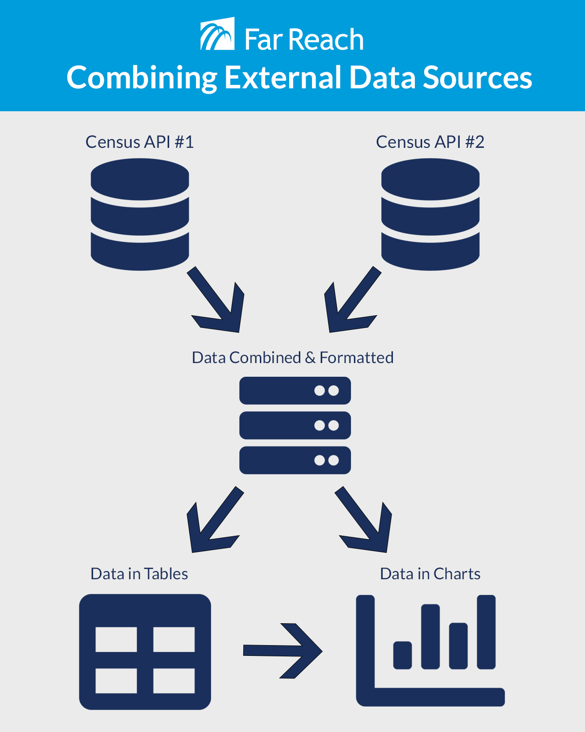
We wanted reports and charts in the system to show these two fields as the same thing on the front end: “Total Population.” To accomplish this, we implemented a lookup table so these two fields could both be referenced as “Total Population”
even though the source data field names don’t match exactly. Front-end users—including admin users—don’t know the difference. They just see the single “Total Population” field. All the heavy lifting of making it
easy and intuitive on the front end is done behind the scenes in the back end code.
Custom Data Combinations
When you pull data from external sources, you’re at the mercy of how they break down the data. The more granular the source data, the more you can do with it because, while you can’t further segment source data, you can combine it.
A good example of this concept is age range. If the source data breaks down age groups by 0-18, 19-29, 39-49, 50+, you can’t display data for the 13-18 age range. However, you can show data for the <29 age range by combing the 0-18 and 19-29
segments into a new attribute.
For the regional data portals, we were able to combine data into custom geographical regions. The Cedar Valley and Bi-State regions are geographical areas created for economic development purposes—the census doesn’t recognize either of these
as regions because they don’t align with census tract, MSA, county, or state geographic lines.
Using more granular data from the Census API, however, we were able to combine data from the smaller geographic regions that make up the larger economic development region. Consequently, we were able to report on both the Cedar Valley and the Bi-State
regions even though they aren’t specifically defined in the source data. Each custom region combines data inputs from smaller defined regions (census tracts and counties) within it and can display the data for the admin-defined geography.
Census API Data Processes
When you integrate with a living, breathing API like the Census feeds, the system can’t just be “set it and forget it.” As changes are made to the API, changes may need to be made to the software that uses it.
In the data portals, we built an automated process that periodically goes out to the U.S. Census and American Community Survey APIs to pull new data and to look for updated data. When we built this custom integration, we guessed that additional
data attributes would be requested by GCVAC and Bi-State, and the URLs for the APIs might change over time. We were correct on both counts.
As they used the system, GCVAC and Bi-State discovered new data attributes they wanted to display. Some of this data came from existing APIs being queried, while others required hitting a different API. And as expected, the US Census continues to evolve
their APIs, which has resulted in some adjustments to the application for older data.
Because we expected both of these things to happen, we were able to design the system in a way that minimizes the work needed to accommodate these types of changes. As part of the automatic API integration, instead of hard-coding values, we included a
configuration file that drives what data to include, which makes it much easier to maintain these additions and changes to the APIs.
Visualizing the Data
By properly integrating and formatting the data on the backend, the portals allow users to easily view reports as charts and graphs as well as in tables.
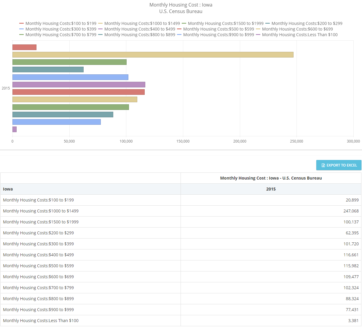
And users can choose whether they want to see the data at an aggregate level (the screenshot above is of Iowa as a whole), or as smaller regions like just Black Hawk County:
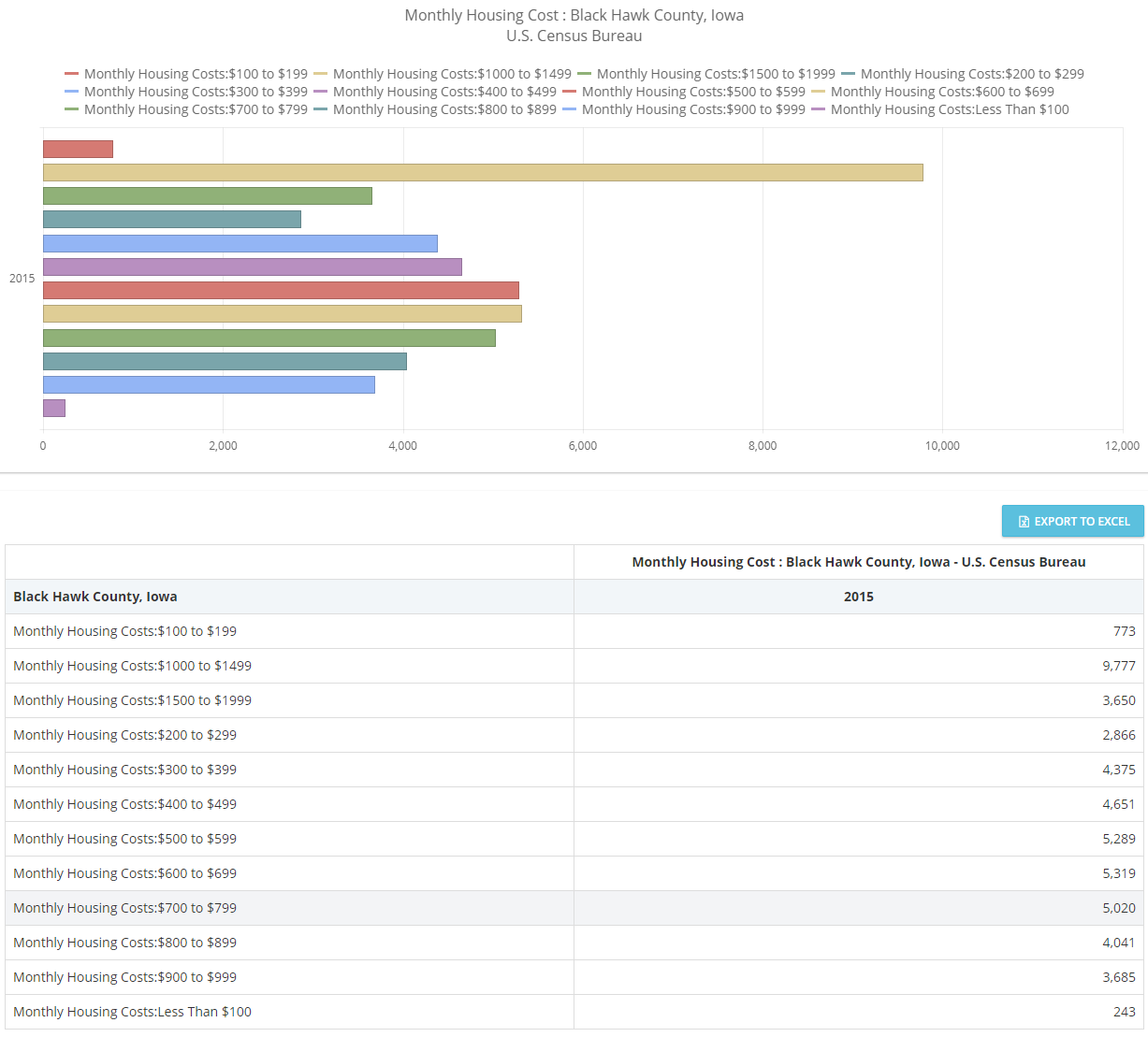
Or the Cedar Valley region:
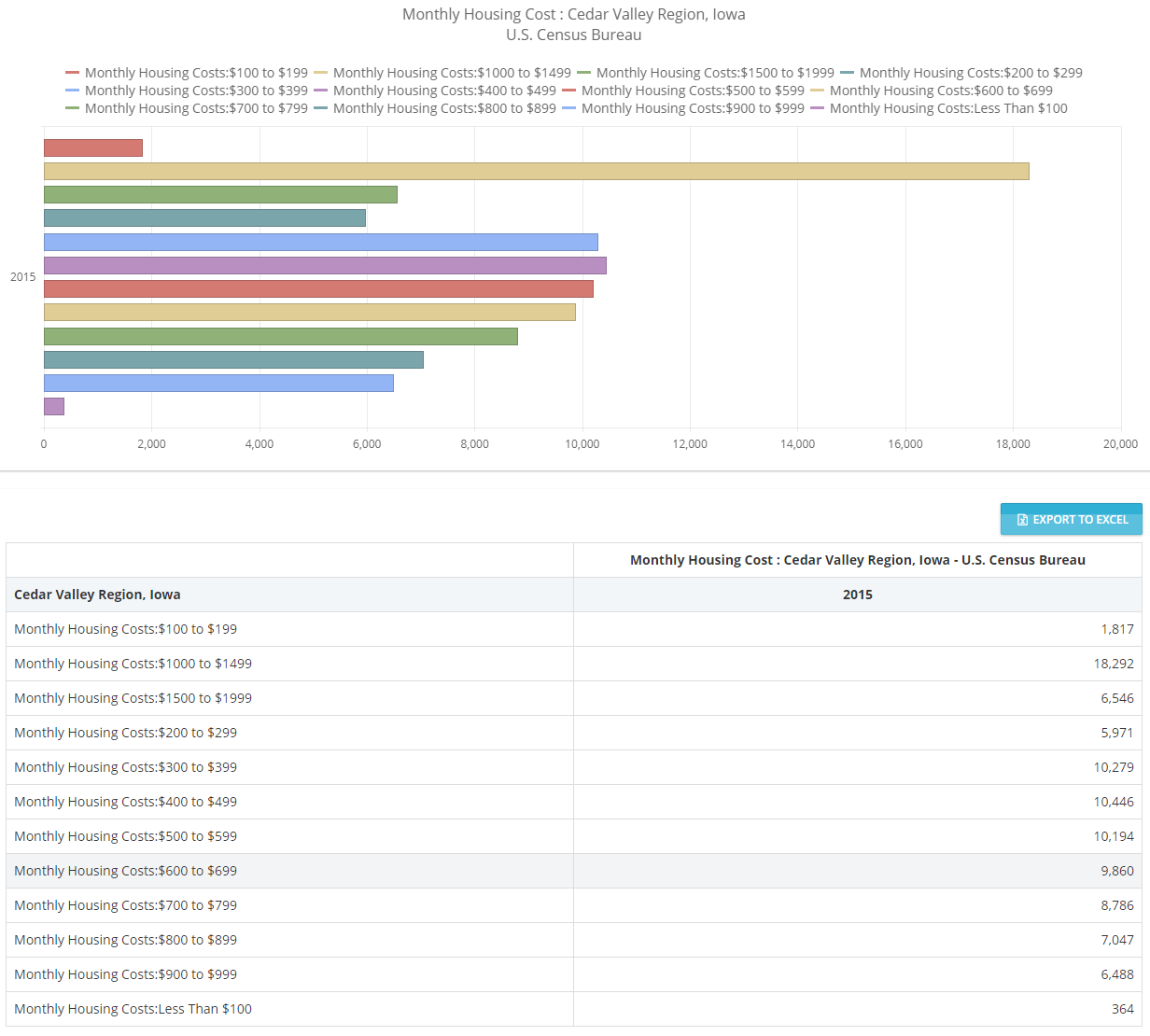
Users can also choose different characteristics and different time periods, all because of how the data from the APIs is integrated and manipulated.
Showing Data on Maps
Another way to visualize data is with maps. While mapping functionality isn’t built into the two data portals, it is implemented in Mortgage MarketSmart.
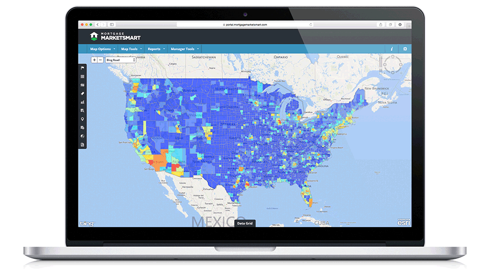
The visual display of data allows user to quickly see, in this case, where the highest volume of mortgage opportunity exists.
Depending on your system and your goals, maps may be a great way to display data in a way that’s meaningful to your users.
The Case for Custom Integrations
There are dozens, if not hundreds, of data visualization tools out there. Many that allow admins and users to upload and view data patterns—Tableau is a well-known example.
While these tools are great for simple data visualizations, when more advanced data integrations, manipulations, and visualizations are required, a custom tool may be the best choice.
For example, the data portals are custom data visualization tools developed mainly so Bi-State and GCVAC could control which types of data to share with the public. This is an external facing tool; if the clients wanted to view and analyze the data internally
only, Tableau might have been a great option.
Custom systems may also be required when data needs to be manipulated prior to presenting it to users. With tools like Tableau, the data generally needs to be manipulated before it’s imported. So in the case of the data portals, GCVAC and Bi-State
would have to spend time adjusting the data before uploading it—a process that happens automatically in their custom systems.
With the Census API integrations, the data in the data portals is automatically updated periodically. With Tableau, the data you upload is the data you have—it’s static. If it needs to be updated, the entire data manipulation process has to
be manually completed again.
While not every data visualization tool needs to be custom—there are plenty of great out-of-the-box tools—when you go beyond basic data collection, integration, manipulation, and visualization, those tools can fall short.
If your business has data integration and visualization needs and you’re not sure whether a custom system is the best route, reach out.