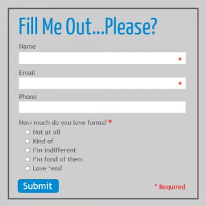
How many times have you been filling out a form—on a website, in an app, or to register for software—and gotten so frustrated that you just quit? Probably more than once, I bet.
Form abandonment is something we strive to lessen for our clients and ourselves. If a user has decided to spend the time to take the next steps via a form, you’d better make damn sure the process is as easy as possible for them.
Forms can be a pain in the ass for users. Over time, we, as users, have formed certain expectations of how a form should look and behave. If a form doesn’t meet expectations, abandonment skyrockets.
Here are 5 simple things to keep in mind to make your forms more effective and less daunting for users:
Consistency
Making user interfaces consistent decreases the amount of learning people have to do and helps pave the way for habit forming—this is fundamental design principle. Consistency can be achieved through:
- Colors
- Instructions
- Behavior
- Size
- Shape
- Labeling
- And more
Consistency allows you to in turn use inconsistency when you want something to be noticed.
Smart Defaults or Pre-Loading Forms
One of the most frustrating things for users is having to enter data they’ve already provided. Displaying fields that are preloaded and can be validated as opposed to having users retype them each time is a much appreciated time saver for users.
Restricting the Format of Input Fields
If you need to restrict the format of data input by users, do so in a way that won’t irritate them. For example, instead of displaying MM/DD/YYYY, consider using a calendar control.
If you’re going to set minimum or maximum character counts for fields, make sure the limits are all-inclusive. For instance, if you set a field minimum of 3 characters for a last name, what happens if a Mr. Yu tries to fill out the form?
Lately we’ve seen password character maximums begin to disappear. Minimums (8+ characters) are still very much relevant, but maximums are starting to go by the wayside. We think it’s because people are using tools (like
1Password) to generate longer passwords, or are using phrases as passwords (such as “ThisIsMyPasswordIHopeICanRememberIt”).
Input Field Type
It’s extremely important to make sure you are using the appropriate type of input fields based on the information you’re requesting from the user. For multiple choice fields, use a radio button if only one option of several is permitted and use check boxes if multiple choices are allowed. Or, as mentioned above, if you’re asking for a date, use a calendar control.
Messages
Provide feedback to the users based on their input—both positive and negative messages. Provide as much feedback as possible, such as, “Your form as been submitted successfully,” or, “The username you requested is already taken.”
There’s nothing more frustrating than getting a form submission error but no detail about what’s wrong. Or, to the contrary, not being sure if the form submitted successfully.
We have plenty of other techniques for making forms suck less, but these are the most widely applicable.
How do you make your forms more user friendly?