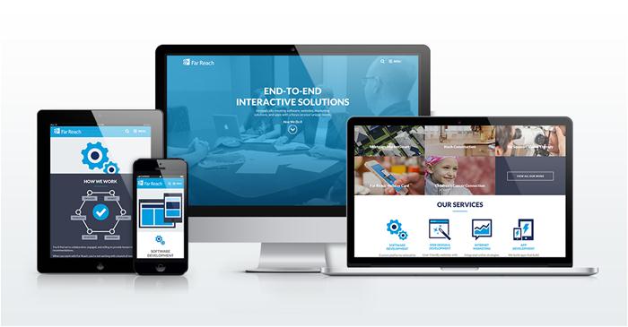
After months of hard work, we’re delighted to unveil the new Far Reach website. We’re extremely proud of it (though we might be a bit biased).
We’ll go into more detail about the strategy behind our site’s design and development in future blog posts. Today we just want to show it off.
Brand New Brand
You’ll see that we updated our brand, including:
- Refined logo and color scheme
- New graphics
- New focus on how our services integrate to help you
We’ll talk in more detail about our rebranding in a future post as well.
It’s Responsive!
Our new website was built using responsive design, which means it will automatically adjust to any screen size.
Now it looks great on any device. Go ahead, try it out:
- Look at it on mobile.
- Pull it up on a tablet.
- Check it out on your big monitor. Watch it as you shrink and grow your browser window.

Sitefinity CMS
We build websites using the Sitefinity content management system, and we used it for our new website, too. Sitefinity allows anyone on our team—developers and non-developers alike—to easily update content using the drag-and-drop interface.
Far Reach Favorites
We asked our team to share their favorite part of the new site. Here’s what they said:
Jason, Lana, and Chris like the Our Work section where we provide a detailed look at some of our client’s challenges, our
solutions, and the results.
Chad likes that the site is simple and purposeful. “There isn’t a lot of fluff,” he said.
Mark and Kate both like the new homepage. (Can you blame them?) The background video is engaging, and the content is presented in a way that’s not overwhelming.
Megan likes the silly pieces of content throughout the site. Especially Kate’s quote on the Far Reach holiday card case study.
Tyler and David like the menu functionality. It was fun for Tyler to implement, and David likes that it’s out of the way, yet easily accessible.
Jen likes the Our Team page, particularly the animated .gif rollover effect. You really have to see it for yourself.
Mike and Jordan like the new modern graphics throughout the site. Our new look is clean and simple.
Enough about us. What’s your favorite part of the new website? Tell us on Facebook or Twitter.