Deep down I am a data guy. I like to dig in to datasets to learn about the data and how to find useful information from it. I especially enjoy finding ways to effectively present data to users in ways that are easy to understand and use.
During the past couple of years at Far Reach I have had the opportunity to work on various projects that involve visualization of data. Two of these projects include the Greater Cedar Valley Alliance & Chamber Data Portal and more recently,
Mortgage MarketSmart. In a recent post I talked about how we focused on usability within Mortgage MarketSmart. Now I am going to focus on visualization of data.
Maps are the primary tool used in the Mortgage MarketSmart application. We use maps to show data geographically. When a dataset is loaded on the map, the counties are filled with a color symbolizing the data attribute for that location. This is all pretty cool, but users want the ability to visualize the data in different ways—the way that lets them get the information they need. With this in mind, we built in the ability to customize the symbology for map layers.
Let's jump to an example. One of the basic actions in the platform is to add one or more datasets to the map. Once the dataset is loaded on the map, the user sees the dataset as a layer on the map with its default symbology.

As you can see, it’s not the most helpful data. Obviously you don’t have context, but trust us, this is too vague.
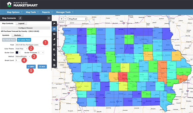
To make the visual data more relevant, users can customize the symbology for the dataset by using a "Custom Theme."
- Field – The attribute in the selected dataset you wish to symbolize.
- Color Theme – The color scheme for symbolizing your data (various colors and a heat map option are available).
- Method – Three different symbology methodologies are provided including Equal Interval, Natural Breaks, and Quantile.
- Break Count – The number of category segments you want to create.
- Apply – Update the selected dataset to reflect the new settings.

Once you have the settings customized, you can save the map and your settings will automatically be applied to your dataset the next time your map loads. Pretty slick!
Applying Data to Decisions
In a recent release of Mortgage MarketSmart, our new Market Comparison Ranking Tool was launched. This tool allows users to compare and rank locations based on selected attributes. The purpose of the tool is to provide insight on which locations are most important to the user based on what criteria they care about.
Once the user has selected their attributes and locations, the ranking engine goes to work and produces a data grid showing the rankings. Notice in the screenshot below that the user sees the raw priority score and can break down the locations into different tiers (groups) based on the priority score and methodology.

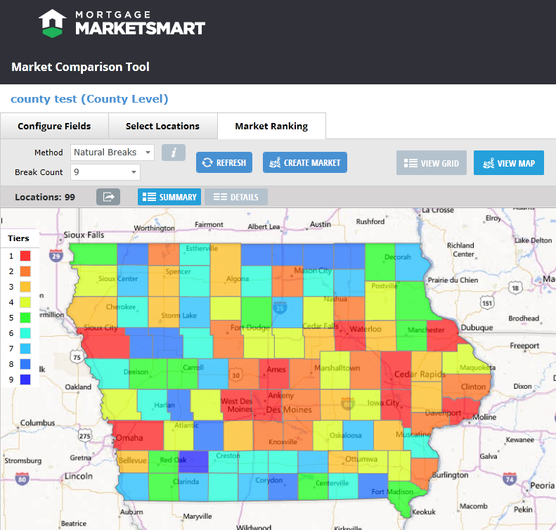
The user can apply methodologies and class breaks just like they did to datasets on a map, but this time the tiers are shown in the data grid. The result is the user-selected data that is important to them and the ability to create tiers of locations where they can focus their efforts and resources.
The tiers from the data grid can be shown in a map to provide a great visual of their market data.

Taking this one step further, the users can choose one or more tiers to create a new market, which can then be added to other maps.
Making sense of data can be a challenge, but by allowing users to customize how the data is displayed in the maps, the data comes to life and allows the user to make better decisions.